Shop Indie Bookstores

Monday, August 29, 2005

The Tender Bar

Wonderful photograph for a memoir of someone who essentially grew up in a bar. I love that the chairs on the tables are all up and that the bar is close to closing (or opening?) and that the kid is still there.

The type is a little too eye-chartish for me, but this jacket is still pretty cool.

The Year of Magical Thinking

Joan Didion's most recent book. Note that the light blue letters form the name "John." (Her husband was John Gregory Dunne.)


Not sure how long the Ray Bradbury books have employed a similar technique:

Room Full of Mirrors

I found these two covers of a new biography of Jimi Hendrix. It's amazing what a little centering -- or in this case, a lot -- can do to spoil a cover. And is that Cooper Black in the second design? Shouldn't that font be used for books about Pet Sounds, and nothing else??? ;-)

(The first is from from problematic, though. Am I the only one who hates how the R, S and A in the upper right hand corner form a really ugly mess o' type?


Sunday, August 28, 2005

Carnivore Diet

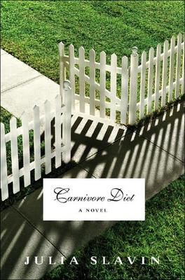
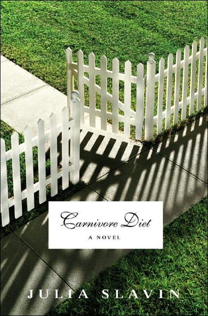
I don't think this cover makes sense until you find out what the novel is about:

"A 500-POUND beast called a chagwa -- with claws of steel, a forked tail and eyes that sprout all over its head -- stalks Washington. Animal Control (in fact, the entire federal government) proves powerless against it. Unfortunately, the chagwa seems to have developed a hunger for Wendy Dunleavy's 15-year-old son, Dylan, and she fears it's her fault. If only she hadn't tossed the monster those frozen Omaha Steaks. If only she hadn't been so doped up on sedatives, she would have known better than to feed a stray animal. Julia Slavin's first novel, ''Carnivore Diet,'' makes this comic premise both reasonably believable and saucily hallucinatory." (From the NYT review)

Having read the review, I like this cover.

Monday, August 22, 2005

Indecision

Good Lord do I love this. Off to the bookstore to find out who the designer is.

Sunday, August 21, 2005

9/11 Images on Book Jacket

"In late January, Alfred A. Knopf will publish "The Good Life," Jay McInerney's first novel in more than six years. Its cover, designed by Chip Kidd, shows a photograph by Quyen Tran of dishes covered with concrete dust. Subtly peeking through the lettering of the title and the author's name is a faint image of one of the World Trade Center towers on fire."

http://www.nytimes.com/2005/08/22/books/22jay.html

A Necessary Spectacle

This is just odd. It looks like it's half done. And I'll eat my hat if that headline font was used in any major newspaper when this match took place.

My Friend Leonard

A bigger fan of handlettering you won't find. But this doesn't do much for me. Anyone else need a little more???

Willful Creatures

When Photoshop goes bad...

And it's a minor point, but the treatment of the title is just way too common. That rectangle with the circular-cut corners is just *everywhere*.

Monday, August 15, 2005

Snow Flower and the Secret Fan

I am of the opinion that less is almost always more. This cover would be so much stronger if only one of the two main graphic (non-text) elements disappeared. My vote would be to eliminate the woman at the top, although you *would* be left with just the cherry blossoms, which seem either trite or obvious.

Here's another example: Death of an Ordinary Man.

I'm sure there are many others.

Hey Nostradamus!

This isn't from the NY Times Sunday Book review. Not much there this week.

I bought this Coupland novel earlier in the week. Coupland designed the cover, which he's also done for other books. (I'll post those after I visit the bookstore and do some more checking.)

I'm not quite sure what I think about this cover -- feel free to tell me what *you* think -- but I do want to ask a question: Who else designs their own covers?

Coupland is a busy guy -- check out what he's up to at http://www.coupland.com.


Sunday, August 14, 2005

And this is forthcoming from Coupland


Betcha he did this cover too.

Monday, August 08, 2005

The Brief and Frightening Reign of Phil

I am in love with this cover.

Tooth and Claw

Can't make up my mind about this one. I almost want this to be more minimalist, less contrast-y, etc.

Sunday, August 07, 2005

Abducted

It's too bad this isn't coming out until October, because I can't think of a better beach read.

My immediate reaction to this cover was that it was too predictable, but I've changed my mind. I'm not an alien or UFO freak, but I do know that the issue of why "abductees" always describe aliens in almost exactly the same way produces two opinions:

1) Abduction must be real: why else would everybody describe the same thing?

2) Abduction isn't real, and the fact that people describe the same thing is merely a cultural production. See X-Files, Close Encounters, etc.

Either way, because I'm guessing that the two questions above are discussed in this book, the archetypal alien works.

Hello Readers

Just a quick note regarding the images on this site.

Some of you visit often and may have noticed that the images are smaller than they used to be. (Click on one of the archive links on the right from a month or two ago to see what I mean.)

Blogger now allows all users to upload photos (one used to have to pay), and they've therefore put a limit on how big uploaded images can be. Unless I can find a hack, what you see below is the new Blogger "Large." We'll just have to look harder :-)

Thanks for stopping by, and keep the comments coming!

UPDATE: Just click on an image and you'll see it at "regular" size.

Snow White and Russian Red

I like this illustration. (Reviewed in the Village Voice, not the Times.)

The Testing of Luther Albright

For those of you who weren't too crazy about "A Novel" appearing in the stem of a mushroom (see here), that might be better than "A Novel" sticking out of someone's neck: