The best -- and sometimes the worst -- of book cover design
Sunday, November 06, 2005
Hung
The ruler is pretty predictable; I like the type, however. And it occurs to me that the ruler takes away from the interesting alignment of the "H" and the "U", if ya know what I mean.
With the correct layout the ruler could have complemented the incidental visual pun of "H" and "U",
but as it is the photo image is too dominant for this to happen. The design would have been much wittier (an appropriate tone, given the subject) and confident without the photo. My guess is that someone (in marketing dept?) lost their nerve
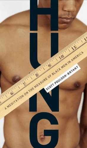
A grabber but ultimately a turnoff, too.
ReplyDeleteWith the correct layout the ruler could have complemented the incidental visual pun of "H" and "U",
ReplyDeletebut as it is the photo image is too dominant for this to happen. The design would have been much wittier (an appropriate tone, given the subject) and confident without the photo. My guess is that someone (in marketing dept?) lost their nerve
Couldn't have said it better myself.
ReplyDelete