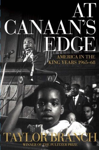
It looks like the marketing department pulled their 'make it bigger' move on the type. Had the title (and author name) been smaller but with some heft to it, I think you'd see Dr. King's face more. Currently its fighting with the title, and the only thing you see clearly is the kid in front (note that the kid's face is not competing with any type).
In fairness, this is the third in of a 3-book trilogy about the life of Dr. King, and the type probably needs to be as it is for the purposes of tying it into the series.
Unfortunately, this is probably the wrong photo to use in a design with series-type parameters
It looks like the marketing department pulled their 'make it bigger' move on the type. Had the title (and author name) been smaller but with some heft to it, I think you'd see Dr. King's face more. Currently its fighting with the title, and the only thing you see clearly is the kid in front (note that the kid's face is not competing with any type).
ReplyDeleteI think you're probably right about the involvement of marketing, Ingrid.
ReplyDeleteIn fairness, this is the third in of a 3-book trilogy about the life of Dr. King, and the type probably needs to be as it is for the purposes of tying it into the series.
ReplyDeleteUnfortunately, this is probably the wrong photo to use in a design with series-type parameters
Wonderful and informative web site. I used information from that site its great. Visa credit card payment online laser hair removal botox redmond wa Broadband internet speed check mcaffee top car air freshener distributors
ReplyDelete