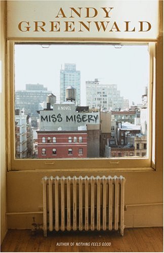
... but I can't help but wonder how it would look with the shade pulled down further ... ? Or maybe a different sized window? Or a different crop ... something feels off, compositionally speaking
Terrible use of a metallic 5th color. The book is pretty terrible as well. Makes me want to leave New York to all the stupid hipsters who think they own it anyway.
I saw this at the store... I think the faux grafitti doesnt convince. bad photoshop of a bad House Industries font. Interesting idea, dont dig on the execution.
What a great idea for a design!
ReplyDelete... but I can't help but wonder how it would look with the shade pulled down further ... ? Or maybe a different sized window? Or a different crop ... something feels off, compositionally speaking
I agree about the composition; it's too bad that the radiator is centered below the window. Still, as you point out, a great idea.
ReplyDeleteTerrible use of a metallic 5th color. The book is pretty terrible as well. Makes me want to leave New York to all the stupid hipsters who think they own it anyway.
ReplyDeleteI saw this at the store... I think the faux grafitti doesnt convince. bad photoshop of a bad House Industries font. Interesting idea, dont dig on the execution.
ReplyDeleteTHIS one got my attention, which is its first objective. I like it enough to look inside, which is the cover's second objective.
ReplyDelete