The best -- and sometimes the worst -- of book cover design
Monday, November 27, 2006
The Three Musketeers
Ladies and gentlemen, get your swords. On top is the UK version of this new translation. On the bottom is the US version. I expect a good duel over this one...which do you like better?
I think they're both really hot. If I had to choose, the American one gets the edge for the reasons already mentioned (more contemporary, less don quixote)
I vote for the American version. Its British approach to the art actually detracts in this instance. The American version is more colourful and clearer in intent. They both look like kids' books though.
Neither, to be honest. Both books firmly plant this classic as children's literature. Although the US cover has more colour and recongnizable shapes, the title and subtitle treatment aren't prominent enough, and the eye doesn't travel well over the composition (where to go once you reache the fleur de lys?).
given the choice i'd go for the US version. ok, perhaps neither are great - but the US version does more things right for me (or is that less things wrong?)
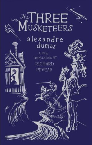

Hmm, the UK version seems to evoke Don Quixote for me, maybe because of the composition and the face that only 2 guys are shown.
ReplyDeleteThe US one is interesting, but not that attractive to me.
I think they're both really hot. If I had to choose, the American one gets the edge for the reasons already mentioned (more contemporary, less don quixote)
ReplyDeleteUK works best for me. It has a jaunty look to me
ReplyDeleteI vote for the American version. Its British approach to the art actually detracts in this instance. The American version is more colourful and clearer in intent. They both look like kids' books though.
ReplyDeleteAmerican version, by far. The British one reminds me, too, of Don Quixote.
ReplyDeleteNeither, to be honest. Both books firmly plant this classic as children's literature. Although the US cover has more colour and recongnizable shapes, the title and subtitle treatment aren't prominent enough, and the eye doesn't travel well over the composition (where to go once you reache the fleur de lys?).
ReplyDeleteUgh on both counts.
given the choice i'd go for the US version. ok, perhaps neither are great - but the US version does more things right for me (or is that less things wrong?)
ReplyDelete