Uncommon Carriers
Man, McPhee has written a lot of books -- according to Wikipedia, this is his 31st. I like this quite a bit -- it seems to be exactly the right tone for the subject -- but I want to see some hand lettering.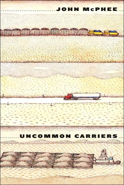


|
Sunday, July 30, 2006Uncommon CarriersMan, McPhee has written a lot of books -- according to Wikipedia, this is his 31st. I like this quite a bit -- it seems to be exactly the right tone for the subject -- but I want to see some hand lettering.
Subscribe to:
Post Comments (Atom)
|
About the BDR
Joseph Sullivan publishes the BDR. Follow him and the BDR on Twitter.
The BDR is on design:related. When linking to the BDR, please use http://www.thebookdesignreview.com NOT affiliated with the NY Times. |
2 comments:
Font, schmont! The whimsical design immediately caught my eye!
Yeah, y'all are probably right. :-)
Post a Comment