The best -- and sometimes the worst -- of book cover design
Monday, December 05, 2005
Living to Tell the Tale
I'm asked several times over the last year if vertically stacking images works. Sometimes it does; most times I don't think it does. Which one do *you* like?
I don't really like any of them. The top one is too dark, the second one is better contrast wise, but then the bottom half doesn't really work. I like the scribbles on the bottom cover, but then the picture looks really odd.
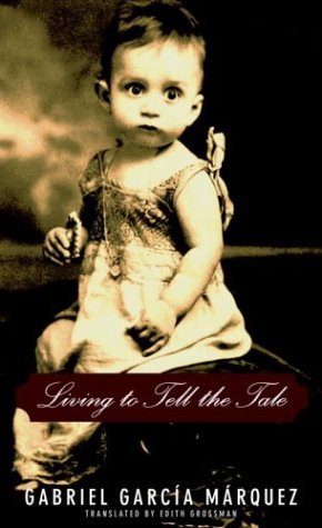


The top cover is great. Reminds me of Angela's Ashes cover. Those other two are losers.
ReplyDeleteI don't really like any of them. The top one is too dark, the second one is better contrast wise, but then the bottom half doesn't really work. I like the scribbles on the bottom cover, but then the picture looks really odd.
ReplyDelete