American Purgatorio
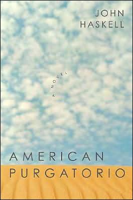
On top, the new paperback. Underneath that, the hardcover. A big improvement, I think. 


|
Sunday, January 22, 2006American PurgatorioOn top, the new paperback. Underneath that, the hardcover. A big improvement, I think.
Subscribe to:
Post Comments (Atom)
|
About the BDR
Joseph Sullivan publishes the BDR. Follow him and the BDR on Twitter.
The BDR is on design:related. When linking to the BDR, please use http://www.thebookdesignreview.com NOT affiliated with the NY Times. |
14 comments:
It's definitely a better image, but I'm not so sure the type and added graphic elements are a vast improvement.
(On the other hand, the arbitrary curl of "A Novel" on the original design is corny)
I change my mind - it's an improvement - argh, hungover again
No and no.
I agree w/ Essrog...and I'm not even hung over! :-)
The whole point of the cover design is to get people to pick up the book, and neither one of these accomplishes that primary task for me.
Well, the paperback graphics certainly catch my eye (but not the photo. It doesn't seem fully resoloved how they interact). The cloth edition? Beh. Snoring.
I always appreciate it when a designer goes that extra inch to forward the idea of the book (rather than the usual fullbleed image + type, which can get tired).
kitty, you are partially correct about "getting people to pick up the book", but it's oversimplifying cover design to say that it's "the whole point". It's only one of a number of metrics that should be used to judge a cover.
Other considerations should include how representative a design is to its content and subject matter, how effectively it communicates to its intended audience (which is not everybody), and finally ... coolness!!! (just joking ... partially)
It really doesn't serve a book for its cover to mislead or misrepresent, even if it does make a browsing customer pick up the book or even purchase it ... only to be disappointed later on.
But yes, I do agree that it is very gratifying for an well-designed cover to be affirmed by someone who picks it up ... buys it ... frames the cover, etc. etc.
And having said ALL this (blah blah blah), I would not be a likely reader of "American Purgatorio". But that alone doesn't disqualify the design.
Just my $0.02 ... apparently sobriety makes me a sanctimonious bore ... apologies
True, essrog, but FIRST y'gotta get the customer to pick up the book. Then the other points may (or may not) come into play.
Personally, I read very little on the cover other than its title. I don't give a twit if it won awards or if Mr. High Falutin absolutely Luv Luv Luv'd! it or not. Once the cover promts me to pick it up, I then begin reading the first page.
There isn't a cover design in the world that can compensate for good writing.
Sorry, I have to disagree that "getting the customer to pick up the book" is the primary concern. If it were so, then a good design would be to emblazon the message: "50 DOLLARS INSIDE!" across the cover, and then lay out the rest of the information as an afterthought.
The quality of picking-up-able-ness (I think you know what I mean) can only considered within the boundaries of the book's subject matter and how its intended audience relates to the book.
That aside, a lot of things about why a book is physically picked up can't be determined by the design. Sometimes it's really how a book is publicized and marketed, and the cover is pretty irrelevant (* sob *).
And frequently ... major buyers like Barnes & Noble reps can determine how a cover will look. In other words, the customer is not only the end consumer / user, the customer also = gatekeepers like the major chains. In such situations, the customer's assessment of the book's pick-uppableness is just irrelevant.
I am encouraged by your apparent disdain for sometimes ridiculous bursty acclaim-type copy - American movie ad design suffers because of it - but unfortunately not everyone shares your preference. Too bad.
And finally (I promise: finally!!), I hate to personalize this ... but ... the intended audience, the customer, will not always be you (specifically: you, kitty!).
(that is ... unless you are the supreme high uberbuyer at Barnes & Noble and amazon, etc ... in which case I eat my words and cower with the appropriate mix of fear and shame)
Well I've filled my quota for excessive bloviating this week ... bye now
Kitty seems to approach most of the covers on this site with disdain. I'd like to see some samples of her design work to see what great book cover design looks like. Please, Kitty, priviledge us with your brilliance.
Au contraire! I don't approach them with "disdain." I approach them as though I were trolling the aisles of B&N looking for something to read, and then I give my immediate reaction.
Laura Hanifin's cover photography on The Right Madness is spectacular. I picked up the book immediately, read that the story takes place in Montana, and bought it. Unfortunately, hard as I tried, I could not read very much, so I gave up and donated the book to our local Library. However, I kept the cover, then I e-mailed Laura Hanifin to tell her how much I love her photo.
Another great cover is In The Bleak Midwinter. Also a great read.
The cover and the title of An English Murder sold me on the book. Alas, even though I did finish reading it, I found the book boring and depressing.
What A Coincidence! has a boring cover, but the book is utterly fascinating. I loved it! Of course, my friend is its author and she mentions me in the book :)
The premise of this great blog is not objective at all; it's subjective. The covers which prompt me to buy a certain book may not jive with anybody else's. Brilliance has nothing to do with it.
One last book ...
I bought Dr. Zhivago because of this cover, not because of this one.
i'd like to ask if any one of you guys blogging here has read this book>?
Post a Comment