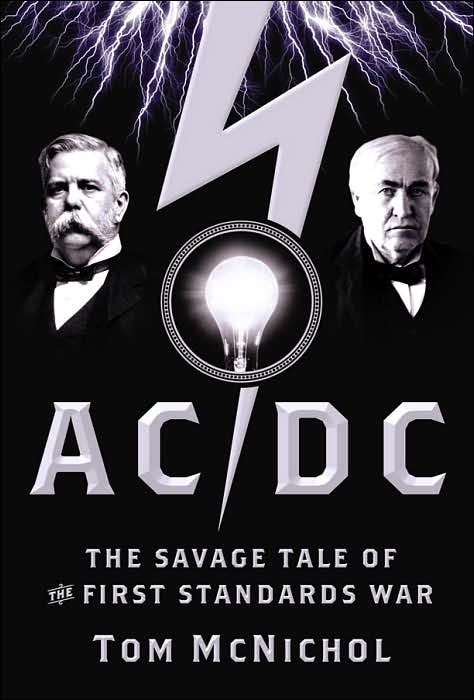
Compelling cover, but my first thought was it was about AC/DC (the band), rather than the electricity. Weird. I wonder if they should have stayed away from anything that looked metal (embossed-look letters, silver on black).
Either that or there will be a lot of metalheads out there learning about current....
Yup, I thought it was about the band, too. But more than that my eye is somehow drawn to the tiny "The" in the sub-title. It looks very out of place to me.
The "the" is a adobe woodtype ornament. I've always wanted to use one, but have never found the right place. Perhaps this proves there is no good use for this glyph.
Compelling cover, but my first thought was it was about AC/DC (the band), rather than the electricity. Weird. I wonder if they should have stayed away from anything that looked metal (embossed-look letters, silver on black).
ReplyDeleteEither that or there will be a lot of metalheads out there learning about current....
Let's not forget the album HIGH VOLTAGE.
ReplyDeleteWhich will now play in my head all day.
Yup, I thought it was about the band, too. But more than that my eye is somehow drawn to the tiny "The" in the sub-title. It looks very out of place to me.
ReplyDeleteI wish the had restraind themselves with the use of "Brothers" by Emigre. It's becoming the new Rosewood.
ReplyDeleteis the "the" a dipthong or something? Just press apple shift whatever and there it is?
ReplyDeleteThe "the" is a adobe woodtype ornament. I've always wanted to use one, but have never found the right place. Perhaps this proves there is no good use for this glyph.
ReplyDelete