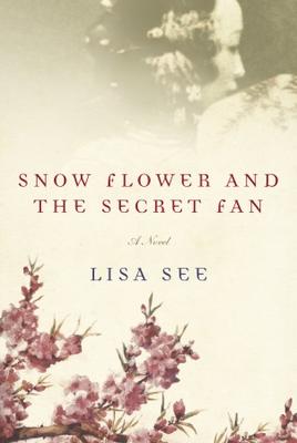
Snow Flower and the Secret Fan
I am of the opinion that less is almost always more. This cover would be so much stronger if only one of the two main graphic (non-text) elements disappeared. My vote would be to eliminate the woman at the top, although you *would* be left with just the cherry blossoms, which seem either trite or obvious.
Here's another example: Death of an Ordinary Man.
I'm sure there are many others.


1 comment:
I agree, one or the other. I covered the blossoms and found the woman to be the better choice.
Post a Comment