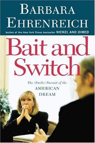
Bait and Switch
Holy bejesus that is some awful kerning on the title. I thought it was perhaps the scan, but here's a photo of the cover. Yikes.


|
Monday, September 05, 2005Bait and SwitchHoly bejesus that is some awful kerning on the title. I thought it was perhaps the scan, but here's a photo of the cover. Yikes.
Subscribe to:
Post Comments (Atom)
|
About the BDR
Joseph Sullivan publishes the BDR. Follow him and the BDR on Twitter.
The BDR is on design:related. When linking to the BDR, please use http://www.thebookdesignreview.com NOT affiliated with the NY Times. |
2 comments:
I'm getting seasick looking at it.
Nasty and the all centered design, yuck. I imagine the author asked for big type so the book stands out more. It seems to be a common misconception by people that bigger type will attract the eyes.
Post a Comment