Miss Misery
Have to get a closer look at this. It looks well done, and I love that it's aiming for depth.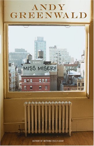


|
Monday, January 16, 2006Miss MiseryHave to get a closer look at this. It looks well done, and I love that it's aiming for depth.
Subscribe to:
Post Comments (Atom)
|
About the BDR
Joseph Sullivan publishes the BDR. Follow him and the BDR on Twitter.
The BDR is on design:related. When linking to the BDR, please use http://www.thebookdesignreview.com NOT affiliated with the NY Times. |
5 comments:
What a great idea for a design!
... but I can't help but wonder how it would look with the shade pulled down further ... ? Or maybe a different sized window? Or a different crop ... something feels off, compositionally speaking
I agree about the composition; it's too bad that the radiator is centered below the window. Still, as you point out, a great idea.
Terrible use of a metallic 5th color. The book is pretty terrible as well. Makes me want to leave New York to all the stupid hipsters who think they own it anyway.
I saw this at the store... I think the faux grafitti doesnt convince. bad photoshop of a bad House Industries font. Interesting idea, dont dig on the execution.
THIS one got my attention, which is its first objective. I like it enough to look inside, which is the cover's second objective.
Post a Comment