Death's Door
I don't often do this, but sometimes a cover seems so lacking to me while the illustration in the Book Review strikes me as so much better. The Times image is by Ray Bartkus.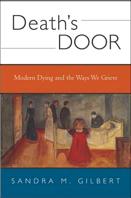


|
Sunday, February 26, 2006Death's DoorI don't often do this, but sometimes a cover seems so lacking to me while the illustration in the Book Review strikes me as so much better. The Times image is by Ray Bartkus.
Subscribe to:
Post Comments (Atom)
|
About the BDR
Joseph Sullivan publishes the BDR. Follow him and the BDR on Twitter.
The BDR is on design:related. When linking to the BDR, please use http://www.thebookdesignreview.com NOT affiliated with the NY Times. |
3 comments:
I really like the first cover. I understand it. The second cover is too gimmicky for me.
I have to say that I hate the original cover. It looks like a small university press edition (one of those ones with bad margins and too-heavy a stock), and the fonts are dry and uninspired. The whole banding thing is a letdown visually as well.
For the content, I'm not sure that the NYT illustration works (it could be construed as too tongue-in-skull and lightweight in tone), but as a visual it certainly wouldl grab my attention more than the actual cover.
It does look like a small press, but it's Norton. And maybe I underestimated the academic nature of the book: "Gilbert parses the poetry of Plath, Lawrence, Tennyson, and Rossetti, among others."
Tongue-in-skull? Ha! :-)
The illustration from the Times probably isn't appropriate for a book that "parses Plath."
Post a Comment