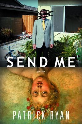
I Like Both of These, But...
I like both of these, particularly the first one, which is by Joe Montgomery. But here's a question to think about:
Are there too many covers like these? The cover for Send Me *really* jumps out at me. I want to know more: why these images, why the scribble over the man's face. I guess what I'm really saying is that the vertical image-on-top-of-image is overdone, but that it's great to see such a design that works.
Re the second: I like it less, but still like it, even though the technique is almost as familiar as that of the first. If you like this jpg, you'll surely like the cover in the store; it, too, is a "jumper."
So: does anyone else look at these, think they're good or even great, but have a slight moment of doubt because you've "seen it before?" Or do you realize that there's only so much you can do in a 6" x 9" space, and only so much that a marketing department will let you get away with, and look at these and say "I've seen something like that before, but wow, this is great!"
OK, I'll shut up now.


3 comments:
.
I don't like either one. For me, the first is too cluttered, almost a sensory overload. My first reaction was to close my eyes.
The second is just boring.
I find the Ryan book is a bit expected, and you're right, overdone--trying too hard to look mysterious. The second cover is okay with a nice type choice.
Post a Comment