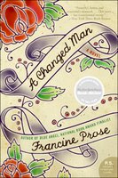
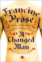
A Changed Man: Hardcover vs. Paperback


When A Changed Man came out last year, I posted the jacket for the hardcover (on the right, above). I and the majority of readers who commented weren't so fond of it. I think "way too Photoshoppy" was my eloquent comment. ;-)
A brief description of the book will show you why the tattoo idea is being used:
Vincent Nolan, a disenchanted member of the neo-Nazi American Rights Movement, walks into the New York office of the World Brotherhood Watch, a human rights organization, and declares, "I want to help you guys save guys like me from becoming guys like me."I like the new one a bunch. Does anyone *not* prefer this to the hardcover? If so, I would love to hear why.


6 comments:
I like the one on the right. (The hardcover?) Beautiful lettering, stark picture really POPS. The other might fade into the background for me.
The new one (the illustrated cover on the left) looks like a historical romance book (with a bit of wit), sort of along the lines of Captain Correlli's Mandolin. It says nothing to me about the book. Its too sweet.
Diana, you bring up an interesting point. Would I notice it from across the room, among other novels in the "New Fiction" section? Actually, I did. But when I saw it a few months ago and picked it up I just didn't find it that impressive.
Currently there's an ad campaign that's running here in Chicago for printers, or ink, or something like that. The images are huge and are on bus kiosks and they feature elaborately tattooed backs of people. They're not real tattoos, and the execution is amazing. Not sure if it's makeup or Photoshop or something else. I might be comparing apples and oranges, though -- probably a safe bet which project had the bigger budget.
I think they both are way off with the type. On the Hardcover the A looks like an H. The type appears too flat and not "tattooed" looking at all. It's blurry and looks like a mess. Olde english is the standard for that type of tattooed lettering. As far as the paperback is concerned. I feel the lines are not bold enough and doesn't reflect the old style watercolor flash sheets that tattoo artists used to paint. The type should have been a nice ornate hard-drawn script, not phoned in using an Adobe product. However I like the paperback much more than the hardcover.
I'm not an artist so the little things that might bother people (it not looking like a real tattoo) don't affect me. Usually, in a bookstore, I'm drawn to covers that really jump out at me for being distinctive or beautiful or brightly colored (still have that childlike "ooh, pretty colors!" thing going on. By the time I examine it close enough to note things like that, the book is already in my hands, and I'm probably reading the blurb or something else to determine its worth.
I'm learning more about this cover stuff every day, though.
I think I saw a similar campaign for jeans, with the fake tattoos. Hasn't that kind of thing been around for ages, though? Remember that Sublime album cover?
I saw one of the ads on the bus kiosk today. It's for Office Max. Can't find an example of it online, though.
Here's an amazing thing about Sublime: the record you mention was released in 1996, and its sales rank on Amazon today is #667. Those crazy kids still love the Ska...
Post a Comment