Does This Look Familiar to Anyone?
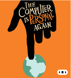
So I'm at a trade show and conference in DC and I walk by the HP booth. And I see something like this:
Ring a bell? It should: compare this (and other similar graphics at the HP.com site) to Jonathan Gray's cover of Extremely Loud & Incredibly Close:
Is this a blatant, um, homage to Gray, or has he brought the whole hand and finger thing over to corporate advertising? There's no mention of anything other than book design on his Web site.
(Thanks, Keith, for the screengrab.)


4 comments:
I guess it goes to show you that borrowing the aesthetic of a book jacket and basing a giant corporate ad campaign on it will only get you so far.
I did a double-take as well, when I visted HP's website a few weeks ago. Some of HP's marketing material is even more similar to the cover of Foer's book -- to the point that it looks like they must have traced the same hand.
It's GOT to be Gray's work. Doesn't it????
Ok, I was curious enough to dig a little. A PDF on this page ("Media alerts" section):
http://tinyurl.com/nu9z6
...credits Goodby, Silverstein and Partners of San Francisco for the hp campaign. That's all the information available there. It's possible Gray had a hand (har har) in this ...
I guess you could always send him an e-mail.
I'm not making a judgement here (yet), but this reminds me of that "Postal Service" music video getting recycled for the Apple-Intel chip ad earlier this year ...
Post a Comment