

The Stolen Child
I'm not a fantasy fan, but whoever designed this--for a book described as a bedtime story for adults, with goblins and such--pretty much nailed it. It's just creepy enough. Deeply saturated greens and reds always shout out EEE-VIL to me.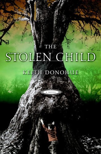
10 comments:
FABulous cover; simply to die for! -- that is, until I saw the child. As a mother, I wish children weren't used like this. I don't read books in which kids & animals are abused/killed, A mother's worst nightmare. In fact, it would be an absolutely perfect design without the tyke. as you said: EEEE-VIL.
Hmmm. That's quite a jump. There's a good summary of the book on Amazon; scroll down to "The Story Behind the Story."
The thing that strikes me about the cover is that it successfully defeats the
Red + Green = Christmas
theory. I did not even think to myself: "Evil Christmas!"
This may not be such a big deal generally. But red + black or blue + black or any of a number of other sinister color combos are more likely choices for this sort of book, so sure, I'm impressed.
If it's up to me, the kid stays in the picture
The kid worked for me too. Perhaps because he doesn't look as if anything bad is happening to him- just that dread feeling. Then again small children can scare me so perhaps that added to the feeling.
Joseph, your blog is aimed at customers' reactions to book covers, and if those book covers compel them to buy the books or not.
The "story behind the story" is irrelevant. That first impression of a child in danger, with no one in sight to help him (primarily a parent), strikes fear in me. That's my first impression, regardless of the story behind its design (which I did read).
With all due respect, this blog is not about "customers' reactions to book covers, and if those book covers compel them to buy the books or not." I don't think I have ever once said "I would buy this book because of the cover." It is about recognizing good design per se, and good design vis-a-vis books.
Okay. Let's say that that was my interpretation of this blog. After all, the primary purpose of the book cover design is to impel customers to at least pick up the book and take a look-see.
However, no matter where I may see this particular artwork, or in what context, my original assessment still stands: It would be a great design sans child.
Yet another blog falls prey to the "I, the reader, shall decide what your blog is about and complain mightily if you do not agree with my assessment" fate.
I was not "complaining." I was mistaken about the blog's purpose. My mistake; no biggie.
What a great site shower faucets for mobile homes Klonopin at low cost Dell inspiron battery giant moster cock Hair loss scales & diffuse & men Bleeding easily paxil
Post a Comment