The Bedroom Secrets of the Master Chefs
UK on top, US on bottom.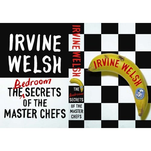


|
Sunday, July 30, 2006
Subscribe to:
Post Comments (Atom)
|
About the BDR
Joseph Sullivan publishes the BDR. Follow him and the BDR on Twitter.
The BDR is on design:related. When linking to the BDR, please use http://www.thebookdesignreview.com NOT affiliated with the NY Times. |
9 comments:
I like the idea of the UK cover, but not having the title on the front cover is generally a bad idea. It certainly looks better than that snoozy US cover, which looks like a classy but bland soup cookbook.
Neither one looks spicy enough, given the title.
The banana on the UK is great tongue in cheek nod to the title. The US strikes me as more dull.
Am I the only one who wishes the banana on the cover was facing up rather than down?
Probably I am.
I don't like either of them, actually. They look boring and either amateurish or campy -- I can't decide which, yet.
there's 3 versions of the UK design - a banana, a sausage and an asparagus (i think?) - which look good together.
in stores i've seen them front and back facing on the shelf. the backs look better!
i mean the front looks better! apologies.
The Bedroom Secrets of the Master Chefs
UK on top, US on bottom.
HA HA HA !!! Best Laugh I've had all week!
I think the UK cover would be much better if the title wansn't on the banana but in one of the squares.
Post a Comment