

The Ruins
It's never really good when the word "preposterous" appears in the first sentence of a review of your book. Worse is when your book features killer plants that "not only try to ensnare all of Mr. Smith’s characters, but also succeed in choking his novel to death." Ouch. On to the cover: I think it's easy to look at the title treatment and say "hmmm, that's too predictable." But to be honest, I can see myself doing something like that. Can you? C'mon, be honest :-)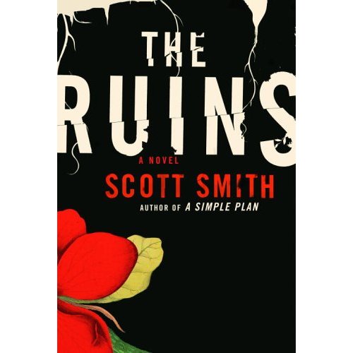
5 comments:
What? Honestly, I read your blog because I design book covers for a living and like to hear what people are saying about my craft. Generally I disagree with your critiques of the jackets you feature. I can tell you're not a designer by what you say. I generally don't like to speak up about it, but I have to call you on your insane thoughts about this cover. It's beautiful, well designed, well balanced and different for a horror novel by a huge commercial writer. This is one of my favorite jackets of the year.
I'd probably go for a slightly more weather-worn grungy look, actually.
Against my better judgment, anon 9:58, I'll comment on what you've written. Did I say this cover was ugly? Ill-designed? Unbalanced? No, I didn't. I also didn't say it was beautiful, well-designed and well-balanced. You did, and that's great -- this is one of your favorites of the year, but not one of mine. A genuine difference of opinion, and now if only you would knock off the ad hominem arguments and sign your name...
I love this cover. It has that 1940's feel to it, but doesn't rely to heavily on being nostaligic. Nice use of type. I don't think it is too predictable. I wish I had designed it.
i don't mind the feel of it at all, but i look and it and think, "man, my eye has no idea where i'm supposed to start."
and that bothers me.
Post a Comment