Tamar
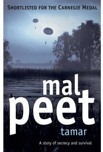
So what happens when you're on the shortlist for the prestigious Carnegie Medal? Your paperback gets redesigned, and your name gets a LOT bigger on the cover.
(And now that he's won, should we expect another redesign?)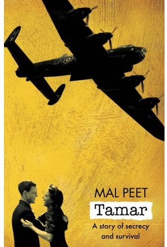


|
Monday, July 03, 2006TamarSo what happens when you're on the shortlist for the prestigious Carnegie Medal? Your paperback gets redesigned, and your name gets a LOT bigger on the cover.
Subscribe to:
Post Comments (Atom)
|
About the BDR
Joseph Sullivan publishes the BDR. Follow him and the BDR on Twitter.
The BDR is on design:related. When linking to the BDR, please use http://www.thebookdesignreview.com NOT affiliated with the NY Times. |
6 comments:
In fairness, it appears as though the redesign is driven in part by a desire to brand "Mal Peet" books under the same design, as is frequently done for other authors.
Go look up the design for "The Penalty" by Mal Peet
Agree with Martin. The type seems wrong for the cover. Doesn't feel serious enough somehow.
The original cover was much, much better.
The redesign type is way too huge. Sure, capitalize on the medal nomination, but don't smack readers upside the head.
I'm in agreement here.
Btw, Katharine, that's how I spell my name, too!
I really like the original. The text isn't leaving a huge impression, but I love the colour and texture of the background, and the way it plays off the vintage, B&W images. I'm pretty indifferent about the redesign. The text is pretty uninspired and it totally overwhelms the rest of the design, which isn't unattractive, but lacks the charm and character of the original.
I read this back when it had the original cover, which was in fact pretty horrible in the flesh - the used-nappy tan was particularly offensive. It's a terrific book, by the way. I think the redesign's better although Peet's name is frickin' huge.
Post a Comment