The Bloodless Revolution
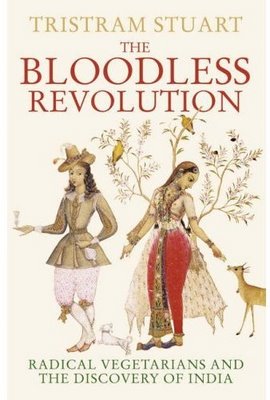
I often feature the UK and US versions of the same book, but I've never noticed such a difference in marketing as exists with this book.
The first image is the UK jacket. Check out the subtitle and the image: the whole "East meets West" theme of this book comes through pretty clearly, doesn't it?
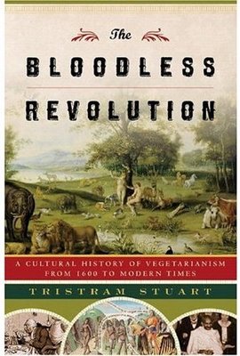
Now the US version: The subtitle is completely different, referring to "a cultural history" instead of explicitly naming India and radical vegetarians. And is that a picture of Adam & Eve on the US cover? (Yes, I see Ghandi too, but...)
Why, smart reader, are there such differences between these? Are such differences necessary to sell this book in these different markets?


1 comment:
I'm an American publisher (nonfiction).
The UK cover is excellent. The US cover is atrocious.
But then we publish reference books....
Post a Comment