

What the Dormouse Said
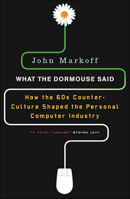
This is one of the better examples of rethinking a cover I've seen in a long time. I think the hardcover (top) pretty much nails it -- the type and pixelated peace symbol are perfect, and the green and black say "old CRT monitor" very clearly. Perhaps the peace symbol was thought to be a little too abstract to equal "counterculture" (I don't necessarily believe that); hence the redesign for the paperback (bottom). For me, the biggest change isn't using the flower and the mouse -- it's moving away from the monitor imagery.
Which one do you like?
4 comments:
I'm too young to appreciate the attempt to emulate an old CRT monitor so the peace symbol just looks misshapen and the subtitle seems too small.
The PB cover combines the more easily recognizable mouse w/the flower power allusion.
The top cover relates to the book's subject matter more accurately but the PB cover is the one that attracts my eye.
I dig the CRT monitor concept, but the mouse treatment is just plain fun-ner.
the cover of the flower with mouse is too obvious and infantile
la tapa de la flor con el mouse es demasiado obvia e infantil
I like the bottom one better. The problem for me is that the type in the upper selection is a typewriter font, not at all one that would have appeared an an early monitor. So that basically ruins the effect for me.
Post a Comment