iWoz
I like how the designer has incorporated elements of what the Apple identity used to look like (the rainbow colors from the old logo). And regardless of if you like them or not, this probably confirms that the reflection effect is taking over.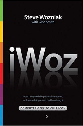


|
Sunday, October 08, 2006iWozI like how the designer has incorporated elements of what the Apple identity used to look like (the rainbow colors from the old logo). And regardless of if you like them or not, this probably confirms that the reflection effect is taking over.
Subscribe to:
Post Comments (Atom)
|
About the BDR
Joseph Sullivan publishes the BDR. Follow him and the BDR on Twitter.
The BDR is on design:related. When linking to the BDR, please use http://www.thebookdesignreview.com NOT affiliated with the NY Times. |
1 comment:
Yes, but the balance is off, which makes me think that it was designed by someone who prefers Windows. If the title had more 'white space' (in this case, black) on either side, I'd feel more comfortable. Mac has always been careful about balance in any of their print missives.
Post a Comment