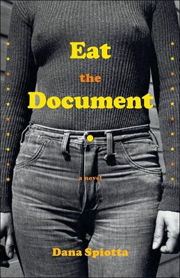
Eat the Document
A great redesign. I didn't think so at first, but then I looked at it a bit harder.
Here's what it's about:
The main characters (are) fugitives after executing a political bombing in the '70s that went awry...Now, in the 1990s, Mary's 15-year-old son Jason (a '70s music buff) begins to uncover his mother's dangerous secret.
So why does the redesign work? Because I'm willing to bet the majority of the book doesn't take place in the 70s but in the 90s, and therefore the image of the main character riding a bus, looking so lonely and clearly disguised (gotta be a wig, right?) is so much more appropriate than the retro-70s hardcover design. Sounds like this book is about who she has become, not necessarily who she was. If so, the paperback nails it.


No comments:
Post a Comment