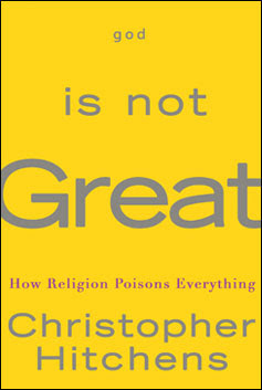
god is not Great: How Religion Poisons Everything
Design by Anne Twomey
So unless you've been in a coma you no doubt have heard of Christopher Hitchens' new book. But maybe you haven't seen it.
I'm really interested in what you have to say about this. I think it's easy to look at this, say "meh...", and move on. But I think there's more going on here. What's up with the line spacing and the variable size of the type? How significant is it to the subject of the book? Is this meant to look like a title crawl with the text moving away from you? And the capitalization of Great?
Help me out here, folks.


9 comments:
I like the concept of the cover design, though I don't like the colors. It's a visual play on words: The size and capitalization of "Great" in relation to other words conveys the grandeur and bigness that the word signifies. "god" is in a smaller type than both "Great" and even "is not," making "god" the least visually prominent word, and in turn, an unworthy entity that contrasts with "Great." In addition, the first letter of "god" is not capitalized as it normally would be, adding to its insignificance. Taken literally, "god" really is not as big or grand as people make him out to be. Now if you take the next line of the title, "How Religion Poisons Everything," God is not good either -- "good" being another aspect of "great." All in all, it's kind of clever.
God is far away...so what is GREAT about that? Maybe that's the idea...
The jacket designer is Fearn Cutler (de Vicq de Cumptich).
Scott
I think it's a lame cover. The serif and sans serif fonts mesh badly. The idea of distance/progression in the title is too sketchily done. The letterspacing in the author's name... I have to stop. It's not worth the time it takes to criticize this one.
I must say, aside from the wierdness of fonts, I do like this cover. I ran into it in person at B&N today and was struck by it. First you read 'Great' then you step in closer to get the whole title. while that may seem irrational it invites inspection, so it works in a way for me.
God is Great. This is not.
I like the concept of this book. Will have to look out for it.
and why is it yellow?
I love it's simplicity.
Smart.
No illustraion needed.
Why not yellow?
Post a Comment