|
Design by Barbara de Wilde
Buy this book from Amazon.com
Elaine Showalter's history of American women writers examines "women's relationship to the literary marketplace" (read Katha Pollitt's Slate review), and the illustration pretty clearly spells out what that relationship has been for most of our history: women have supported the canon but have rarely been granted access to the center of it.

/1/ "The biggest change for the literary world since Gutenberg invented the printing press more than 500 years ago" debuts in London. Anyone use one of these things yet?
 /2/ "NASAimages.org is the end-all source for all media that NASA currently has to offer. It is, in other words, the mother lode." A great image resource, via Ben Pieratt. Here are the rules. /2/ "NASAimages.org is the end-all source for all media that NASA currently has to offer. It is, in other words, the mother lode." A great image resource, via Ben Pieratt. Here are the rules.
/3/ New York Magazine has launched the Vulture Reading Room, for which "four or five enthusiastic, creative people (critics, poets, novelists, bloggers)...go to town, in whatever way they see fit, on some inherently fascinating literary object." First up: Charlotte Roche's Wetlands. (Spoiler alert: the consensus is "ewwww.")
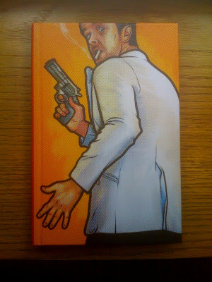
Designer credit to come
Penguin's willingness to play loose with the placement of their logo (and, at times, incorporate it as a real design element) is delightful.
Two more examples here and here.

1984 60th Anniversary Edition designed by Jason Johnson
From what I can tell, Plume's 60th Anniversary Edition of Orwell's 1984 recycles a design first used in 1983, which is notable because it's one of the few covers I've ever seen for 1984 that doesn't bring to mind any one of the following words or phrases:
big
scary
ominous
gigantic eyeball

Below is a design from 1978 a reader sent in; it (and Shepard Fairey's recent cover) is the kind of design we're most used to seeing.

Not having read this book in a very long time, what's the better approach? The subtlety of Johnson's design (those are eyes, btw), or aggressive, jackbooted thugs?
Design by Barbara de Wilde
The DayGlo orange question mark (not so bright here, but trust me, "glo" it does) shouts from across the room that there's a question that needs to be answered: who stole the Mona Lisa in 1911, almost 400 years after da Vinci finished it? The answer's not so simple: Vincenzo Peruggia was arrested after trying to sell it in 1913 to the Ufizzi Gallery in Florence, but author R.A. Scotti discusses others' possible involvement in the theft. Pablo Picasso and Guillaume Apollinaire (who is credited with coining the word "surrealism") were among the suspects.

There's more than a small nod toward surrealism in de Wilde's cover, and a pretty brilliant juxtaposition of the modern with the classical (suggestive of modern art's relationship to its historic past). Again, trust me: find this at your local bookstore and see just how unique this is.
Designer info to come
At first this struck me as a little jumbled, with little visual hierarchy, but then I learned (according to this glowing review) how appropriate this is: "things explode in Kevin Wilson’s stories: expectations, parents, body parts, cows." There is a story about cheerleaders obsessed with model cars, and how nice that the image reminds us of an exploded view.

Buy this book from Amazon.com
Design by Mario J. Pulice
At first glance, an attractive, competent, and unremarkable cover for David Foster Wallace's 2005 commencement address to Kenyon College graduates.
On second thought: a pretty exceptional design.

Here's why: read the address. Wallace is urging everyone to try to escape what he calls our "default setting" of self-centeredness, but he leaves as an open question just what the environment you live in will look like. To paraphrase one of his examples, get pissed off at the person who just cut you off on the expressway, or realize that it just might be possible that car is rushing a sick child to the hospital, and that in fact it is you who is in their way.
The goldfish is here because of the story with which Wallace begins his address, but what makes this design work is the absence of water, the "this" of the title. It's not there because Wallace is sagely telling his audience that it's up to them to construct the world in which they'll live as adults, to determine if their water will be clear and bright or polluted and full of shit.
Buy This Is Water from Amazon.com
|
|