

Late '80s Harry Crews Harper Perennial Fiction editions
Illustrations by George Corsillo
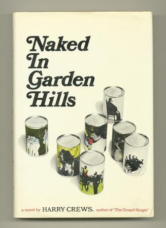
A busy week has kept me out of the bookstores, so here are a few from home. Frequent BDR readers know I'm a big Harry Crews fan, constantly on the prowl for that copy of Naked In Garden Hills that *isn't* $150. (Should you ever see this at a garage sale or whatever, can you pick it up for me? Seriously.)
I'm not sure how many Crews books were published in this series; these are the ones I own. Two thoughts popped into my mind when I was scanning these:
1) Man, 1988 was a long time ago in book-cover-years.
2) Wow, these aren't just yellow. They're YELLOW. But yellow books don't sell...right?
Discuss.


10 comments:
Actually, there's a company named "Lengua de trapo", a great publishing house from Spain. Their novel collection is yellow. I love their books, by the way.
Mind you, I'm not saying yellow is bad for sales; it's just something I've heard people say over the years. Have no idea if it's true.
Yellow is actually a big color right now. See hot indie sellers Olive Kitteridge and Mudbound, among others.
James: thanks for those. I'd love to know how the whole "yellow doesn't sell" thing started, if you've got any thoughts.
I loved the novel CAR by Crews but can't recall the cover art.
Indeed 1988 seems very far in Book cover design.
I quite like their old-fashioned style though.
In France, there is a great collection of crime and detective novels called "Le Masque" with black typing on yellow background covers.
Here is an example: http://www.chapitre.com/CHAPITRE/fr/BOOK/carr-john-dickson/la-chambre-ardente,1160955.aspx
It has been going on for years (1927) and though there has been variation, the yellow is clearly part of their trademark.
What the hell is happening with those letterspaces? It's bizarre, but also very charming. I really like them.
I agree. The kerning of the letters is pretty wack, but somehow seems fitting given the quirky nature of the design. Also, there's some kind of fixation on arms.
As far as the yellow book thing goes, I'm not sure where it originated, but as a counter, I'm thinking of the Bukowski novel, "Ham on Rye," printed by Black Sparrow Press.
these are all great. something about it all makes it disturbingly cool to look at... the 80s for you.
Post a Comment