
|
Illustrations by George Corsillo
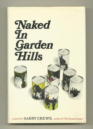
A busy week has kept me out of the bookstores, so here are a few from home. Frequent BDR readers know I'm a big Harry Crews fan, constantly on the prowl for that copy of Naked In Garden Hills that *isn't* $150. (Should you ever see this at a garage sale or whatever, can you pick it up for me? Seriously.)
I'm not sure how many Crews books were published in this series; these are the ones I own. Two thoughts popped into my mind when I was scanning these:
1) Man, 1988 was a long time ago in book-cover-years.
2) Wow, these aren't just yellow. They're YELLOW. But yellow books don't sell...right?
Discuss.


Design by Milan Bozic
I hope there's a word or a name for this -- and by "this" I mean a novel that starts on the front cover of the book. It's been done before (on a few older Penguins(?)), but can't put my hands on any other examples at the moment. Anyone got any? (UPDATE: See the comments for at least one other example several other examples.)
And the coolest thing about this, BTW: verso pages are even-numbered, and recto pages odd-numbered, right? Are you sure? Click the images to enlarge and check.

.jpg)
Design by Jarrod Taylor
Flirtation and the competition among students and teachers at an Upper East Side prep school is the focus of Hummingbirds; the jacket is beautifully whimsical and (sorry for the tired phrasing) jumps right off the shelf.

That vibrant blue really pops, just like it does on Digging to America. I've come to have such a low opinion of blue -- too many years spent in Web design -- but these restore my faith :-)

Designs by Robert Jensen
"A BüK is an inexpensive pamphlet—just $1.49—containing one provocative essay, short story, portfolio of pictures, collection of poems, or other surprising entertainment, readable in the time it takes to drink a cup of coffee" (from the BükAmerica Web site).
We don't talk about the business of publishing much here, but I wonder if (and hope that) there's room for this kind of chapbook meets the Pocket Penguins approach. Thoughts?
(PS: I did ask publisher Lisa Lyons about the use of everyone's favorite typeface, Comic Sans. Through her, designer Robert Jensen said: “It seemed apt. And as Vincent Connare, its creator, has written: "If you love comic sans, you really don’t know much about typography. And if you hate it, you really don’t know much about typography either." That quote always makes me giggle; here's a great article about Comic Sans and its creator.)


Designer credit to come
Cover art by Wally Wood
Wally Wood's "Disneyland Memorial Orgy," first published in The Realist in 1967, is reproduced (in part) on the cover of counterculture icon Paul Krassner's recent collection of essays.
I didn't really think about this or see it at first, but it's pretty cool how the design reiterated the question asked in the title. What's covered up by the other design elements? Why are *those* things covered up? Oh, because they're obscene. But says who?

If you want to see Mickey shooting up and Dumbo pooping on Donald Duck (among other things), check out the uncolored original.
Design by W.G. Cookman
John Derbyshire sounds like a total jackhole, but he's got to have a sense of humor, because this is one of the funniest author photos I've ever seen. Not sure if that's supposed to be him on the button on the cover (probably not), but both of them have the Republican frown down pat.

.jpg)
Designer credit to come
Am I alone in digging the simplicity of this?

A question: does one of these look more "right" to you?
 
Your answer most likely depends on where you buy your books and the language they're written in. There are very few rules in design, but there are conventions, and it's the norm for those of us in the States to crane our necks to the right in order to read the text on a book's spine. Readers of French, among others, have to tilt their heads to the left.
There are some interesting theories about the advantages confered by each design convention; this Metafilter thread lays out the arguments:
When text on a spine reads from top to bottom, as it does on US, UK and Canadian (and some German?) books, the text is readable when the book lays on a table.
But then there's the "Harry Potter / encyclopedia argument" for bottom-to-top text: "Say you have a set of volumes...with the North American convention, on the shelf you have 1-5 from left to right, and the cover is always pointing right. Take them off the shelf and place them face up on a table, and you have to reverse the order if you want volume 1 on the top. Flip the spine around and the cover will point left on the shelf, but you can't see the cover, so who cares? Take that stack off the shelf and place it face up on a table.. Voila, volume 1 is on the top!"
Anyone else heard or have other theories?
PS: This post was inspired by a lunchtime walk during which bottom-to-top signage was jumping out at me. The sign for the Wit Hotel seems especially odd to my eye:
.jpg)
.jpg)
PPS: the second book cover -- bottom to top -- is the published cover.

Hey y'all, Austin here. I wanted to take my last day here at the BDR to blog about one of my favorite cartoonists, John Porcellino, and his amazing life-long work, King-Cat Comics and Stories.

For over 20 years, Porcellino has been drawing and releasing his self-published comics. They're all handmade: photocopied black on white paper, folded and stapled, with a consistent and instantly recognizable cover design.
A new collection, Map of My Heart, has just been released, and again, Drawn and Quarterly has succeeded with their formula: add one simple color to the black and white, retain the King-Cat design. (HUGE thanks to my online buddy and cartoonist/writer Derik Badman for taking these pictures for me... go visit his site for some of the best writing about comics on the 'net!)
I love the map included on the inside cover! (For more examples of maps included in books, see my post, " Maps of Fictional Worlds")
|
|


.jpg)


.jpg)
.jpg)


.jpg)


.jpg)
.jpg)


