Tooth and Claw
Can't make up my mind about this one. I almost want this to be more minimalist, less contrast-y, etc.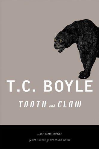


|
Monday, August 08, 2005Tooth and ClawCan't make up my mind about this one. I almost want this to be more minimalist, less contrast-y, etc.
Subscribe to:
Post Comments (Atom)
|
About the BDR
Joseph Sullivan publishes the BDR. Follow him and the BDR on Twitter.
The BDR is on design:related. When linking to the BDR, please use http://www.thebookdesignreview.com NOT affiliated with the NY Times. |
3 comments:
The cat is the only good feature here. The other colors are all wrong. Very snobby high brow. It's as though they're trying to impress me with their artistic ability instead of trying to sell me on the story inside.
Kitty's comments are all wrong. Very snobbish and high brow. It's as though she's trying to impress me with her artistic knowledge instead of giving an example of covers that she's thinks aren't all wrong.
See this book in person, then talk.
Kitty, you are always wrong. Escpecially about the Indescision cover. It was illustrated by the rediculously talented Brain Rea. I didn't get why I disagrred with everything you said design wise, until I looked at your blog. Please find a new hobby.
Forgive my spelling and ranting. the ct gets to me.
Post a Comment