Family and Other Accidents
Charming and cute, but I wonder if this would be better if:
1. family/and/other/accidents/a novel weren't displayed so linearly, and
2. the author's name was below the egg carton, or elsewhere.
Thoughts?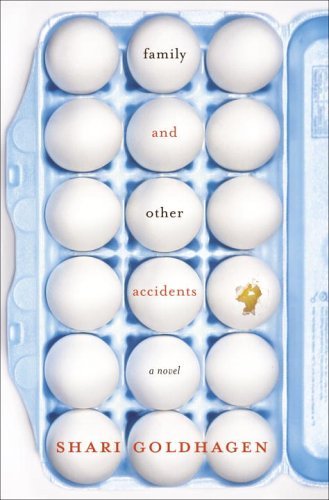
Buy this book


|
Sunday, April 30, 2006Family and Other AccidentsCharming and cute, but I wonder if this would be better if:
Subscribe to:
Post Comments (Atom)
|
About the BDR
Joseph Sullivan publishes the BDR. Follow him and the BDR on Twitter.
The BDR is on design:related. When linking to the BDR, please use http://www.thebookdesignreview.com NOT affiliated with the NY Times. |
3 comments:
This is dreadful.
I agree with kitty. The egg carton is eye-catching but makes it difficult to read the title. The whole cover feels a bit vulgar overall.
Another thing I notice is that it's fashionable nowadays to have the words "a novel" on the cover. Would you be more willing to pick up a book if it had those words on the cover? The practice seems pretentious to me - silly, at the least.
This is a good concept (suggesting fragility and precious-ness) but the execution blows it especially with the author's last name. And I do agree with point # 1: type too linear.
If the type treatment doesn't commit, neither can the viewer
Post a Comment