

Heat
I am a big believer in "simple is best, and the simpler, the better." Thus I love this -- but only in principle. It seems to me that the colors are all wrong. I get the use of yellow -- but what's with the blue? Isn't a warm / hot palette needed here?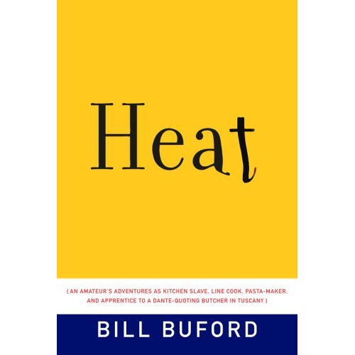
8 comments:
When I logged on, I saw only the yellow part of the book, which confused me when you mentioned "the blue." Then I saw it. Too bad it's part of the cover because the yellow part, with melting letters, is perfect.
I agree with you about the blue..Red hot would have been great.
Like the red much better. I did however order the book. I think authors should start giving you a kick back. I find tons of great reads on here.
Counterintuitive to read down>up, but wouldn't it be better with the lines of type rising up, irregular at the top edge—type as flame? Tweak, tweak...
Arty: Absolutely. I was messing around with the type going the other way, with a ragged edge to suggest flames. It didn't quite look like I wanted it to, but I'll try again and see if I like it better. We are thinking alike, tho. :-)
Eileen: Thanks. This is fun to do. You have to tell us more about your book!
Joseph: Great minds, fools never, yadayada... By the way, see here my delinquent earlier post:
http://www.blogger.com/comment.g?blogID=10466335&postID=114584950830812506
;-)
I think it might be a very stylized (and poor) interpretation of a flame--blue on the bottom, a bit of white, yellow, orange, then red--except they only have the blue/white/yellow part, so it doesn't make sense. But amybe a good concept.
Post a Comment