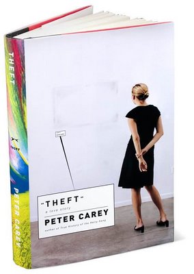
Theft
Have wanted to post this for awhile, and as there's not much in this week's Review, here it is.
A little background: one review at Amazon calls this "a barbed, intriguing art caper."
I can't quite make up my mind about this jacket. The designer is Chip Kidd, and if anyone could have gotten away without a title and author on the front, it's him. I know that's pretty unrealistic and would give the marketing department serious fits, but I look at this image and somehow think it would be stronger if I had to work a little harder to put meaning behind what the woman is looking (or not looking) at. Thoughts?


6 comments:
I agree, Joseph. Peter Carey won the Booker Prize and has a major fan base. This book is (predictably) getting great reviews all over. It could stand having a teeny-tiny title/author, and would definitely get people to lift it off the shelf. The weirdo enlargement of the missing painting's i.d. really disrupts the image. It might have been better if it was a magnifying glass or something, b/c at least that way it would make sense, but it would still be very clunky.
Nothing catches my eye. Dull.
Unfortunately, names sell books. I think Penguin released a line of books with strong cover designs without title nor author -- Penguin Originals. But sales were dismal and so they put the text back on the covers.
My first thought is that I love your blog.
I agree with these fine folks. However, I like that all the color is on the spine - for some reason, it intrigues me.
Thanks for the kind words, Amanda(rama). I enjoy doing this.
If I remember correctly, the colored spine is actually the extension of a painting that is on the back cover. Well, not a real painting, but you know what I mean :-)
Kinda sorta reminiscent, conceptually, of the cover for Art.
Post a Comment