Cross Country
I guess that a book with a subtitle this long needs an equally chaotic jacket.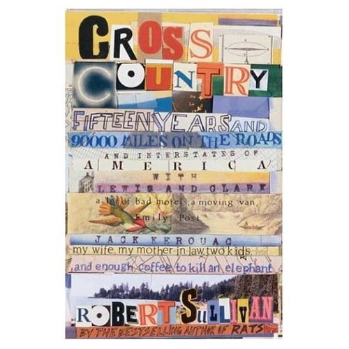


|
Monday, July 03, 2006
Subscribe to:
Post Comments (Atom)
|
About the BDR
Joseph Sullivan publishes the BDR. Follow him and the BDR on Twitter.
The BDR is on design:related. When linking to the BDR, please use http://www.thebookdesignreview.com NOT affiliated with the NY Times. |
7 comments:
When I read the review I was wondering how they'd handle that sub-title...I guess this answers my question. It hurts my eyes though...
I would run screaming from this cover.
Really? I think this is a very very great cover. It gives off a very aimless, wandering vibe. No, it's not very attractive, but I'm sure the story itself is far from neat and tidy.
I might LOVE the book- but it might be one of those books where I handily craft my own jacket from a brown paper bag. The book itself sounds very fun. The cover not so much.
I have to say that this is growing on me. If you think of the chaos as all the hand-lettered signs you would see on the sides of roads, barns, in front of little shops, etc., it makes a kind of sense.
That's a hell of a subtitle. The cover does not make me want to read the book - but the book does.
The design does seem like an apt reflection of the scattered-sounding title / subtitle,
and it's suggestive of that Beat Generation "cut-up" technique pioneered by Brion Gysin.
The connection here is
- Jack Kerouac, who did a famous "Cross Country" of his own ("On the Road"),
- who was a key figure among the Beats and a contemporary of Brion Gysin,
- who made the cut-up technique a graphic counterpart to the literary experimentalism of the Beats
- which is demonstrated in this design ... for better or worse
Yes, I'll concede it's a bit of a stretch. And having said all this, I think a cut-up design is defensible for this cover, but the execution could have been better
Post a Comment