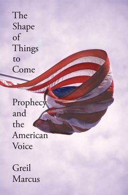
The Shape of Things to Come
If you're like me (I'm sure you are much smarter), you've (tried to) read Marcus before. You were taken in by things like the Jamie Reid art and words like "syndicalism." And then you realized you had no idea what the F he was talking about, and you sold the book, which is now on the shelf of some accountant with a philosophy minor who is about to have a similar epiphany some day soon.
But I digress. This is odd, isn't it? The photo is wonderful--you know what it is at first glance, but then you have to do a little work to understand the angle at which it was shot and confirm that in fact your first glance was correct. I love it.
But the text? There has to be a story behind it. There has to be a reason why the word "prophecy" is touching the flag. Anyone care to wager a guess?


8 comments:
I totally agree. The image is extremely compelling; the type leaves much to be desired. I wonder if there is some sort of rationalization behind it? If so, it's completely lost on me. A shame, really.
Yes, there's a reason. The word prophecy is long, and the space between the margin and the flag is narrow. Pretty much it, actually.
That's a baaad reason. . .
;)
I agree with anon. It's most likely due to space. It does, of course, generate discussions of hidden meanings and the like. But the simplest reason is usually the accurate one.
It reminds me of McCourt's reason for naming his book "Angela's Ashes." Everyone tried to attribute some deep, dark meaning when the real reason was that he had written a much longer version originally in which his mother had died and had been cremated.
Don't know why the word prophecy is touching the flag 'cept for the reason stated: it's a long word. The only reason I can think of for the type going down the side like that (which I do not like at all) is that it is supposed to represent a flagpole, and so the flag sits at half-mast. Though I can't quite get why that'd be given the title. At least it'd be a stretch. Maybe I'm way off. :)
Cheers!
I love this
I think the title treatment is a direct reference to american poet Langston Hughes. His poetry was often arranged in exactly this way. Hughes fits perfectly into Marcus' purview and I imagine is mentioned in the book.
Brian, thank you. That's what I was looking for.
Post a Comment