

A Hedonist in the Cellar
Hmmm. I'm more of a Pabst Blue Ribbon kind of guy, so I wasn't aware that McInerney wrote about wine. But I'm guessing it goes something like this: "Here you go again. All messed up and no place to go. Worse, you don't know where to get a nice bottle of chianti in NYC for under $20."
Seriously, though: does anyone else think less would be more here -- that is, fewer circles would have made this stronger?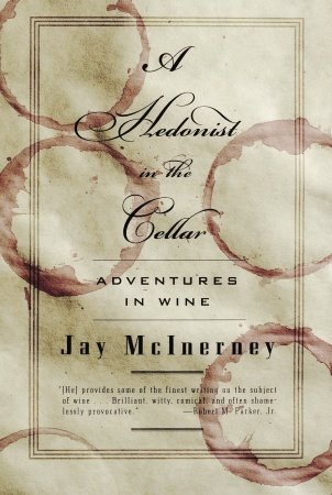
9 comments:
I love the cover- it looks very tactile. Then again I love wine so it's possible that it is just the positive association
The first word in the title is "Hedonist", so in this case I think more is more.
yeah, I'm with anon. Design-wise, I could do without some of the circles, but within the context of the title, I think it works.
That's a great point. I stand corrected. Now back to my delicious Pabst... :-)
McInerney is way into food & wine (and himself).
http://www.houseandgarden.com/main/blogs/dining/
I'm surprised that none of the circles overlap.
I'm surprised there are four - I would have either gone with more circles, and an odd number at that to create a friction, or just three. And yes, overlapping would have been good.
Oops. I didn't see the fifth one in the lower left corner. My bad.
Amen to the more is more argument. I wonder if this could've been done with just a ridiculous, paper-ruining number of rings that almost turns the crumpled white texture into the negative space... without ruining readability. Probably not, but a fella can dream.
Post a Comment