
|
The BDR, and more specifically, book covers I've tagged as favorites of 2007, are being discussed over at Paper Cuts, Dwight Garner's blog about books at The New York Times Online.
I think that's probably the longest sentence I've ever written. :-)
Help me out with this one: I really want to like this, but something's just not right: I think it's because the subtitle and author name are fighting with the title for my attention. Reduce those two elements (subtitle and author name), tuck them under the "47" and to the right of the stock of the gun, and I think we might have something a little stronger. Reserving the military stenciling for the title might help a bit too.

(This is a UK title, so I don't know who designed it. Anyone know?)
US design by Henry Sene Yee
There's some information about the paperback design on Henry Sene Yee's blog, and some images of rejected comps. (Scroll down a bit, as the images are spread out among several posts). The final US version is below; it's glossy and the title type is embossed:

The UK edition is, well, pretty darned flat:

Buy the US edition from Amazon.com
The BDR takes a tour down south -- way south -- with these covers from Argentinian designer Juan Pablo Cambariere. Like Matt Dawson before him, Juan Pablo was nice enough to explain the thinking behind these covers and some of the details of the design process. Thanks, Juan Pablo!
Gold from Moscu (El oro de moscu)


Gold from Moscu (El oro de moscu) discloses the connection between the Argentinean Communist Party and the Soviet Union’s government, which was thought to financially support this party with huge amounts of money. It´s full of Cold War-style mystery and myths about this relationship, its methods and its consequences.
The editor’s first suggestion was to use a picture of a golden ingot. I thought that a simulation of a package as book cover was more appropriate, and we arrived at the idea of a worn-out package, the interior of which is unknown (in order to apply the old idea that says that ignorance is the origin of all fears).
So I built a package with all its real elements, in order to create the correct atmosphere. I made a real package with craft paper, tied it with a cord and put a few stamps on it, and then photographed it. Most of the time the front and back cover information is modified just a couple of hours before taking it to the printer company, so I had no other choice than to leave some empty spaces, so that I could simulate the stamps in Photoshop. I pity I wasn´t able to stamp all of the words as well, for that would have worked out better for sure.
Another positive aspect is that the book itself is pretty thick (550 pages), so this makes it look like a real package.
Lived lives (Vida de vivos)


Lived lives (Vida de vivos) is a collection of interviews of a colourful and heterogeneous group of local celebrities by one of our most distinguished journalists.
Although I applied the same idea and resources that I used in Gold from Moscu, this cover turned out much easier. If you ever visit a newspaper’s headquarters, you will see that most of the journalists have their desktop drawers full of old tapes with old interviews, a lot of them unlabeled. I thought one of these tapes was a perfect representation of this book: the old, raw, uncensored, unedited interview lost in the back of a drawer. I just had to take a simple picture of it and try not to ruin it with the text, so what I did was to simulate a sticker/label using varnish. This sticker continues across the spine and to the back of the book.
This ad has popped up in downtown Chicago:

But the idea popped up here earlier: (book design by Jamie Keenan)

Katie Roiphe's Uncommon Arrangements is getting a good deal of attention, and why wouldn't it? It's an "astute and engrossing examination of seven artsy marriages from 20th-century England" that is "provocative, dishy, substantive and fun." And I think we all know what "artsy marriage" means ;-)

So why, then, is this one of the sleepiest covers I've seen in a very long time? I'm 100% sure I would never pick this up in a bookstore, and 99% sure I wouldn't notice it's there.
Design by Gray 318
About to finish DeLillo's Falling Man, I think I need a something a little lighter for my next book. This might be it:

From the Publishers Weekly review: "Baron Wolfgang von Kempelen of Hungary, anxious to win the favor of Empress Maria Theresia, builds an engineering marvel: the Mechanical Turk, a chess-playing automaton. The Turk, though, isn't exactly as it seems; hidden inside is Italian chess prodigy (and dwarf) Tibor Scardenelli." Murder, deceit and other tasty things follow.
The silhouette approach seems very appropriate for a novel set in 1770.
Buy this book from Amazon.com
UPDATE: A most awesome reader points out that the UK cover is pretty wonderful as well:

And like the little eye on this jacket, the falling woman on the left is a nice asymmetrical touch.
Designer unknown (UK edition)

There's nothing about this cover that I don't like. The Guardian review glows; I'll have to keep my eye out for this when it's released in the States.
And by the way, just so that you don't pick this up and think it's actually a self-help title, the American edition will be called Pravda, because that won't cause any confusion either ;-)
Design by Jonathan Sainsbury
Aside from some reservations about the type, this really works for me for two reasons:
1) All that luscious space in the top half really catches your eye when placed next to other books that fill up the entire format, and
2) Placing the photo and the type in the bottom half is a nice visual reference to the title and subject of the book. It's nice to see a designer who thinks through words and concepts like "pit" and "crater" and designs something that reaches out to them.

Buy this book from Amazon.com
Design by Alex Camlin
Fans of comics and graphic novels will have to tell the rest of us if vertical text is commonly used in those media -- I just don't know.

The use of primary colors plus black and white works very nicely here, and the eye on the left is a great addition -- it underscores the graphic nature of the subject and it breaks the symmetry of the overall design. Nice.
Buy this book at Amazon.com
I've been publishing this blog for almost three years and I don't think I've ever seen such a difference in approaches in covers for the US and UK markets. US is on top, UK on the bottom. And here's a link to the Guardian UK review so that you can begin to try to figure out what the ants mean.
NOTE: The Guardian review shows the cover with the soldier image but this version doesn't seem to be on sale until October 2007; the black and red cover appears to be what's currently on sale in the UK. Sorry for any confusion.


Design by Alister MacInnes
Remember when I was looking for more book covers and jackets with no titles on the front? Designer Alister MacInnes sent this in recently.

Alister passed along in an email: "The final cover is based on that famous nightmare of getting up in front of a crowded room only to realise that you are standing in your underwear. The audience gives reference to the kinds of talks that are discussed in the book e.g. weddings, funerals, kids talks, etc."
Alister, I know you told me that this is coming out in September, but could you tell us if this is UK market only or if we'll see it in the States and elsewhere?
Design by Greta Polo
My fondness for scribbles continues. Past examples can be seen here.
I don't know that I love this cover as a whole. It's a bit all over the place -- I think there are 4 different type / lettering styles -- and the Chicago map is a bit much (although perhaps Northwestern University Press just couldn't resist). But oh, that scribbling.

Design by Kimberly Glyder Design.
Today's question: how would you design a jacket for a novel that desperately, aggressively, willfully tries not to be a novel -- a book that "does away with most narrative conventions -- plot, colorful characters, dramatic conflict," using instead "a collage of very short anecdotes, apocryphal legends, aphorisms, (and) lurid gossip...run(ning) through (a) fragmented consciousness?" And one that begs comparison to Joyce, Beckett, Burroughs, Ginsberg and Shakespearean sonnets, just to name a few? (Read the wonderful NY Times review, from which the above quotes are taken.)
Here's the answer:

The debate begins...now.
Paperback designed by Megan Wilson, photo on paperback by Andrew Geiger
I raved about the hardcover for Gallatin Canyon when it was published about a year ago (read the original post here), and while I might not love it as much as I did back then, it's still a pretty fine cover. (Actually, it's the photograph that grabbed me):

The cover for the paperback is, by comparison, a big disappointment:

Design by Will Staehle
The reflection of the city in the shoe shows attention to detail and some imagination, but I'm not sure if the whole jacket adds up to a winner. (And does anyone else think symbols standing for letters is getting a bit tired?)

Designers unknown
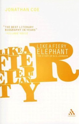
Off to the bookstore ASAP to find a copy of Like a Fiery Elephant; I have to know what's happening on the spine and the back.
I'm pretty sure this edition of Christie Malry's Own Double-Entry is out of print, so if anyone knows anything about this, please leave a comment.
Both of these would stop me in my tracks in a bookstore.

Whenever I think about not buying the Pocket Penguins 70th Anniversary box set I punch myself in the face. I *love* how the images on these three are so dominant, and yet there's great treatment of type as well.


I want to like this, as the image is pretty arresting. And while at first I was focused on the fisheye title text as the element I didn't like, it's the alignment of the title / subtitle / author name that ultimately throws this off, I think.

Here's what it might look like with the title centered on the main image (instead of the whole format) and with a different location of the subtitle and author name.

|
|


