|
If it weren't for Pynchon's Against the Day, I would have to say that Cormac McCarthy's The Road is likely the most anticipated novel of the year. Check out this glowing Village Voice review, which calls it "near perfect" and asserts "it may be the saddest, most haunting book he's ever written, or that you'll ever read."
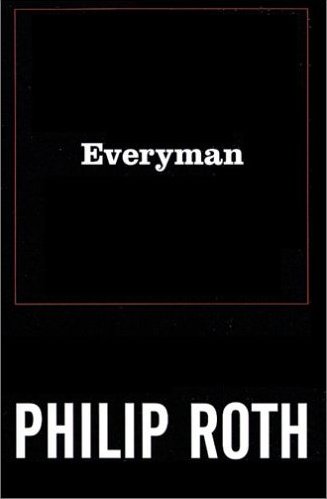
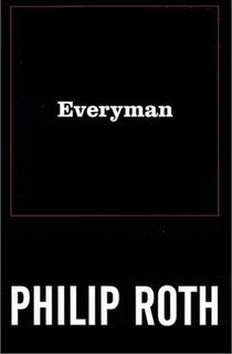
It's hard not to notice the similarities between this book's jacket and that of Everyman. And for me, it's hard not to think that these designs aren't, for lack of a better word, respectful. Here are two hugely important writers who are not getting any younger (both were born in 1933); if anyone deserves to be known by their names alone at this point in their careers, it's them.
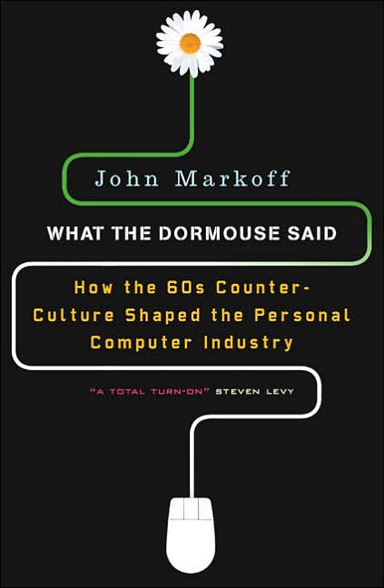
This is one of the better examples of rethinking a cover I've seen in a long time. I think the hardcover (top) pretty much nails it -- the type and pixelated peace symbol are perfect, and the green and black say "old CRT monitor" very clearly. Perhaps the peace symbol was thought to be a little too abstract to equal "counterculture" (I don't necessarily believe that); hence the redesign for the paperback (bottom). For me, the biggest change isn't using the flower and the mouse -- it's moving away from the monitor imagery.
Which one do you like?


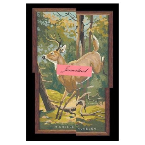
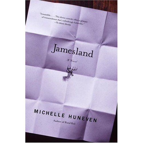
I'll leave it up to you to read this review to find out about the deer on both the HC (top) and PB (bottom). But if someone's read this and can tell us if the folded stationary means anything, please do.


Lots of the Vintage International covers are really great; this is one of my favorites. The novel concerns "John James Todd, forgotten hero of the cinematic avant-garde of the 1920s and 1930s," and the illustration looks exactly right for that period.
I was on the fence about this one:
But then I remembered how much I (and others) disliked the hardcover and I started to feel better about the paperback. Here's the hardcover:

I'm far from a fan of this kind of design, but thank you, thank you for not putting a weapon or some such thing on the cover. (Both Van Gogh and his assailant were riding bicycles).

Put this one in the "a blind man could have seen this one coming" category. What's suprising to me is that it really says nothing about New York -- the little medallion of skyline hardly does it.

Crews' novella, the first thing he's published in 8 years, is not exactly getting great reviews. And the cover looks pretty dreadful (regardless of the quality of the scan):

That said, I'm a big Crews fan. A Childhood: The Biography of a Place is probably my favorite memoir, and A Feast of Snakes simply kicks ass. If you've not yet read any Crews, I would start with those. And here's a great NY Times article about him.
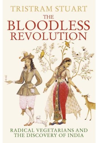
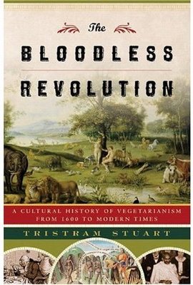
I often feature the UK and US versions of the same book, but I've never noticed such a difference in marketing as exists with this book.
The first image is the UK jacket. Check out the subtitle and the image: the whole "East meets West" theme of this book comes through pretty clearly, doesn't it?
Now the US version: The subtitle is completely different, referring to "a cultural history" instead of explicitly naming India and radical vegetarians. And is that a picture of Adam & Eve on the US cover? (Yes, I see Ghandi too, but...)
Why, smart reader, are there such differences between these? Are such differences necessary to sell this book in these different markets?

A biography of the only president who used to (proudly, by all accounts) relieve himself in the White House Garden should be bold as all hell. Thankfully, it is:

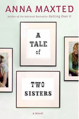
The subject of this is (surprise!) sisters in London. Contemporary London. Yeah, I don't get the Wild West type either.
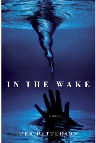
Forget the picture -- yes, this book is about a family that drowns -- and look at that letter spacing. And now tell yourself that you'll *never* do anything like that.

Since this book is getting so much press, I thought I would post the cover. I don't really feel strongly one way or the other. So what do you think?

The cat I get. But is there something called Schrodinger's Pastrami Sandwich that I should know about?

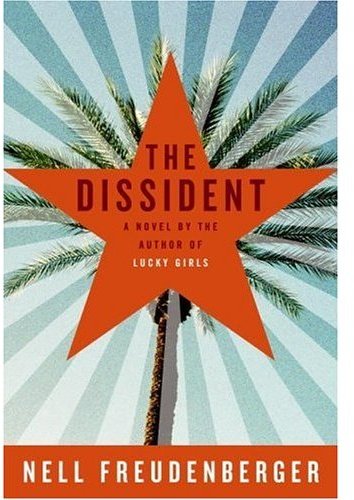
What it's about:
Yuan Zhao, a celebrated Chinese performance artist and political dissident, has accepted a one year's artist's residency in Los Angeles. I see both California *and* China in this. Nice, nice work. 
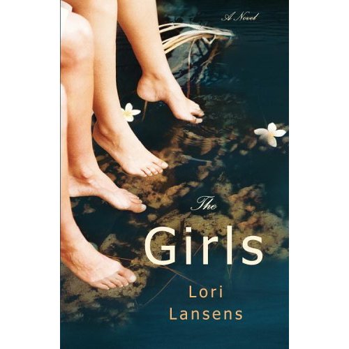
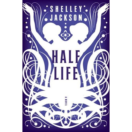
Two quite different approaches to novels about conjoined twins. And finally, a jacket with feet that makes sense :-)


If the figure is photographed from the back and already references something that's unsayable, do we really need the blurring of the photo?

Wow...if the front of this book looks like this, I can't imagine how many blurbs are on the back.

UPDATE: Reader Gregg was nice enough to write in:
For the beasts of no nation, all the blurbs are on a removable belly band, I attached what the cover looks like without it. Also, its printed on
uncoated stock and yes, even more blurbs on the back!
Thanks, Gregg! Here's the cover w/o the band:

Every so often there is a jacket that reminds me of something Chip Kidd said in his Onion interview (which seems to be offline, unfortunately). Y'all probably know the quote:
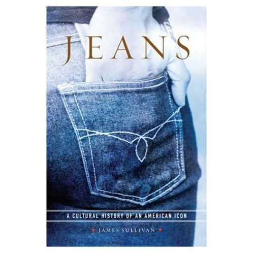
One of the things I learned while majoring in graphic design in college, that I've always taken very much to heart... The teacher one day drew an apple on the blackboard, and then wrote the word "apple" underneath it. He pointed to the whole thing and he said, "You should never do this." He covered up the picture and said, "You either just have the word," then covered up the word and said, "or you just have the picture. But don't do both." It's insulting to the reader, or the viewer, or whoever. With these words in mind, I give you Jeans. PS: does anyone know what kind of jeans these are? 
Both of these are UK versions; I can't find an image of the US release.
At first I liked the simplicity of the 1st jacket. Here's a one-sentence description of the book; consider if the cover makes sense. (I think it does):
To each other's regret, both Marshall and Joyce survived 9/11. But it looks unlikely that they will survive the apparently endless war of their divorce. I don't like this as much as I once did, however, because something about it makes it look more like a T-shirt than a book cover. (Call me out on this one, BTW -- I've had way too much sun this weekend.)  Here's the second version: 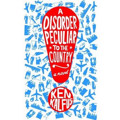 This certainly caught my eye, but I couldn't shake the feeling that I've seen this style (or something very similar) before. And then I remembered: 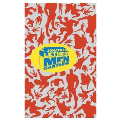 The Lethem book is by the ridiculously talented Jonathan Gray.
I remember seeing the hardcover design for this book (bottom) when it came out. I think I didn't post it 'cause I figured you wouldn't want to hear me complain once again about my distaste for bad Photoshopped jackets.
The paperback is much better, but those blurbs are pretty annoying.

|
|