Pleasurable Kingdom
OK...everyone together...one, two, three: AWWWWWWWWWWWWW
Buy this book


|
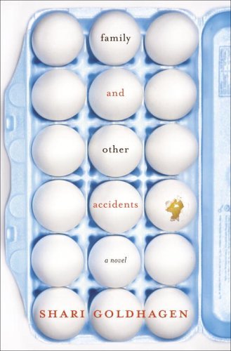
Sunday, April 30, 2006Interview w/ Chip Kidd, and a note on the cover belowChip Kidd is interviewed by Jonathan Safran Foer in the May issue of I.D. Blind Willow, Sleeping WomanI'm a huge fan of Murakami and of Mssrss. Kidd and Gall, who seem to divide the Murakami catalog into hardcover (Kidd) and paperback (Gall). So if history means anything, this should be Kidd, but it looks like John Gall's work to me. Possible Side EffectsThis -- the 6-fingered hand -- has to have been done before. I don't have any prizes to give, but certainly someone can point out another similar (if not identical) cover? Stravinsky: The Second ExileWhen I see this in person I bet I'll really like it. I love the chair w/ the jacket and I'm dying to see what that is in the background. Family and Other AccidentsCharming and cute, but I wonder if this would be better if: Sunday, April 23, 2006New Will Self coversWill Self is a wonderful, trippy writer, and his books definitely deserved an overhaul. I'm always excited when an author's catalog gets this kind of unified treatment: The Chick-Lit DebacleWe've all heard by now about the "unintentional and unconscious" copying that has Kaavya Viswanathan in a little plagiarism trouble. Here's an article. Glow-in-the-dark Haunted?An ad in this weekend's NYTimes Book Review said that this new paperback glows in the dark. No mention of that at Amazon or at the Anchor Books site. Attention all fellow word dorksI'm assuming there are a few of you out there... :-) Suite FrancaiseCelebrated in pre-WWII France for her bestselling fiction, the Jewish Russian-born Némirovsky was shipped to Auschwitz in the summer of 1942, months after this long-lost masterwork was composed. Némirovsky, a convert to Catholicism, began a planned five-novel cycle as Nazi forces overran northern France in 1940. (description from Amazon.com) Two things about this cover: Is it me, or does the photo look staged? I would be surprised if this photo really did date from the '40s. The two main figures are especially suspect. Secondly, anyone know what typeface that is? No doubt chosen for its mid-century, Deco-ish feel, but I think it's just awful. 
Philosophy Made SimpleI majored in philosophy, and I can't remember anything about elephant trunks and cowboy boots. Can anyone help a brother out? Sunday, April 16, 2006Elements of Style(from the NYT Review): The cover art for Wendy Wasserstein's "Elements of Style" makes this book look like an expensive present. The design cruelly underscores that there will be no more gifts from Ms. Wasserstein, the endearingly funny and much-admired Pulitzer Prize-winning playwright. She died in January at 55. Her first novel is her last. 
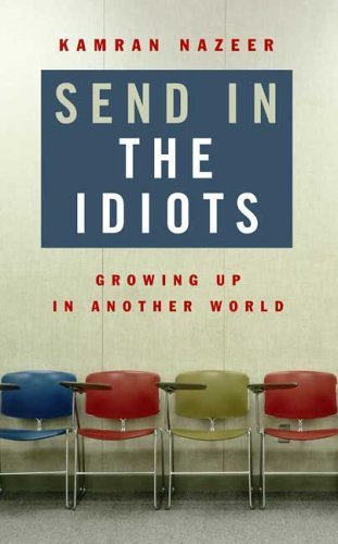
Send in the IdiotsDiagnosed w/ autism, Nazeer tries to find four of the "Idiots" with whom he went to school. Gay Talese: A Writer's LifeI really didn't know what Gay Talese looked like, but the NY Times calls him "America's nattiest author" (take that, Tom Wolfe!) And indeed, he's one natty dude. Halfway HouseLove this. The upside-down house could have been too much, but it's not. A really nice lesson in taking care with the edge of the format. Seventeen-year-old Angie has just routed the competition in the individual medley, and she's acting strangely, babbling to her teammates at the pool's edge. Her parents, Jordana and Pieter, wonder if she's on drugs — or maybe the pressure of college applications has gotten to her. Then, during her younger brother's race, Angie throws herself into the pool, swims to the bottom and stays there. Angie has had a psychotic break... 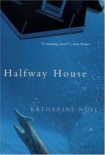
TowelheadQuite different approaches, and based on the description of the book, it's the paperback (top) that gets it right: Jasira, the 13-year-old narrator of Erian's bluntly erotic first novel, can't hide her budding sexuality. When her mother sends her to live with her Lebanese-born father in Houston, she endures anti-Arab slurs, the attentions of a predatory neighbor, and her father's mix of Old World Dignity and undisguised hostility.  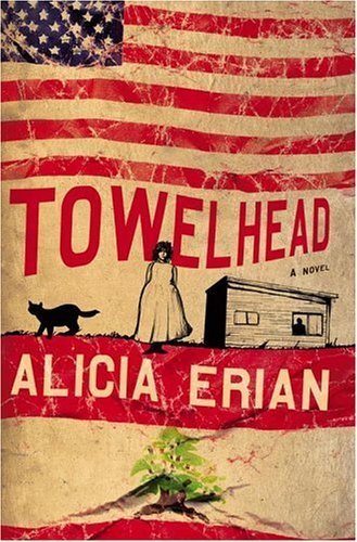
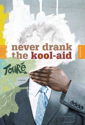
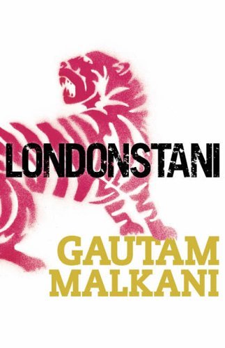
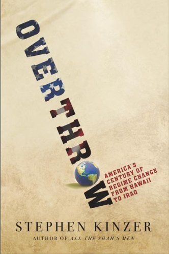
A Death in BelmontThat's the palm of a hand. What's it got to do with this book? Junger's parents hired Albert DeSalvo, the alleged Boston Strangler, as a builder when he was an infant. IndecisionLast year's hardcover was one of my favorites. I'm pretty surprised that they went w/ something different for the paperback. (The new paperback is on top, the hardcover below it): Sunday, April 09, 2006Samuel Beckett: Grove Centenary Editions, vols. 1-4Design by Laura Lindgren. Lovely. When I first saw them I thought they were from McSweeney's. (And you hard-core Beckett will have to tell me what they mean.) Never Drank the Kool-AidI have to see this at the bookstore; it looks gorgeous. GirlbombUsually not a big fan of this kind of cover ("this kind" = picture of people from behind, or of their feet, etc), but I think I like this. The type isn't mind-blowing but I like the crop on the photo, especially how it just catches the word "CITY" in the Radio City Music Hall sign. Challenger ParkThis one really pops off the shelf in the store. Beautiful, deeply saturated colors. Sunday, April 02, 2006LondonstaniGraffiti stencil, meet book cover. Book cover, graffiti stencil. OverthrowMight just be me, but the stars-and-stripes lettering is a bit much, no? Otherwise, really nice and rather unconventional for a politics title. Penguin Classic Deluxe EditionsHow cool is this? Penguin Classics presents the Graphic Classics - timeless works of literature featuring amazing, one-of-a-kind cover illustrations from some today's best graphic artists. These Penguin Classics Deluxe Editions also feature French flaps, rough fronts and luxurious packaging. Look for more Deluxe Classics with illustrated covers in the months ahead!   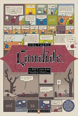    Who did which one? Check out the credits here.
Subscribe to:
Posts (Atom)
|
About the BDR
Joseph Sullivan publishes the BDR. Follow him and the BDR on Twitter.
The BDR is on design:related. When linking to the BDR, please use http://www.thebookdesignreview.com NOT affiliated with the NY Times. |